Email Marketing Cover Banner Ideas: Mastering the art of designing an effective email marketing cover banner can transform your campaigns and boost engagement. As the first thing your audience sees, a well-crafted cover banner sets the tone, conveys key messages, and encourages readers to take action. In this blog, you’ll discover actionable tips, design inspirations, and best practices to create stunning banners that captivate your audience and elevate your email marketing strategy.
Table of Contents
Introduction
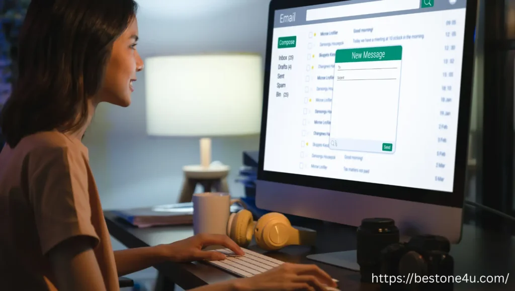
Imagine opening an email, and the first thing you see is a vibrant, visually appealing banner that grabs your attention instantly. That’s the power of an email marketing cover banner — it’s the digital equivalent of a front-page headline that sets the tone for the entire message.
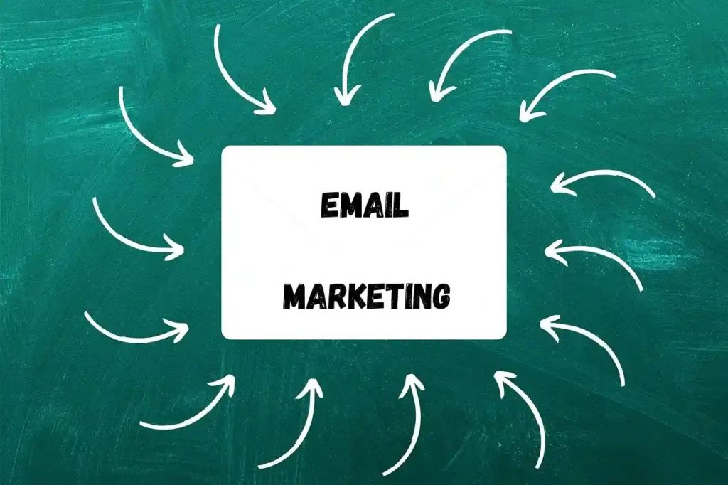
An email marketing cover banner is a prominent graphic element placed at the top of an email. It often includes a captivating image, engaging text, and sometimes a strong call-to-action (CTA). These banners are designed to capture attention, convey the email’s theme, and encourage readers to continue scrolling or clicking through.
But why is this seemingly simple design element so important? In today’s fast-paced digital world, inboxes are flooded with promotional emails. People often skim through content and decide within seconds whether an email is worth their time. This is where a well-crafted email marketing cover banner becomes a game-changer. It visually conveys the core message, builds anticipation, and significantly boosts engagement rates.
What Is an Email Marketing Cover Banner?
Picture this: You receive an email from your favorite brand. Before you even read a single word, you’re greeted by a vibrant graphic that sets the tone — perhaps announcing a sale, showcasing a new product, or simply adding visual flair. That, right there, is an email marketing cover banner in action.
Definition and Purpose
An email marketing cover banner is the top section of an email, typically a wide, visually engaging graphic that spans the email’s width. It serves as the first visual touchpoint and plays a crucial role in:
- Communicating the primary message of the email
- Capturing the reader’s attention within seconds
- Establishing brand identity and setting the tone for the rest of the content
Think of it as the hero image of your email campaign — bold, enticing, and packed with purpose.
Key Components of a Cover Banner
To make an effective email marketing cover banner, these elements are essential:
- Eye-Catching Visuals:
Use high-quality images or graphics that resonate with your audience and align with the theme of the email. - Compelling Text:
Include short, impactful phrases that highlight the main offer or message. For example, “Flash Sale: 50% Off Today Only!” - Call to Action (Optional):
Encourage engagement by adding a clear CTA like “Shop Now,” “Explore More,” or “Learn More.” - Consistent Branding:
Use brand colors, fonts, and logo placement to reinforce brand identity. - Mobile-Friendly Design:
Ensure the banner looks great across different devices by optimizing its size and resolution.
Why Are Email Marketing Cover Banners Important?
Imagine you’re scrolling through your inbox, skimming dozens of emails. What makes you stop and pay attention? More often than not, it’s a striking visual or headline that grabs your eye. That’s exactly what an email marketing cover banner is designed to do — captivate your reader and deliver your message quickly.
Let’s break down why these cover banners matter and how they can transform your email campaigns.
Benefits of Using Cover Banners in Emails
- Instantly Captures Attention:
- A bold, well-designed banner draws the reader in, making it more likely they’ll continue reading the email.
- Sets the Tone for the Message:
- Whether it’s announcing a sale, introducing a product, or sharing company news, the banner communicates the mood of the content right away.
- Enhances Brand Identity:
- Consistent use of branded elements like colors, fonts, and visuals in your cover banner reinforces brand recognition.
- Conveys Complex Information Quickly:
- A simple yet visually appealing banner can communicate key offers or ideas at a glance without relying on lengthy text.
- Supports Key Campaign Goals:
- Banners help guide readers toward desired actions, such as clicking a CTA, visiting a landing page, or making a purchase.
Impact on User Engagement and Conversions
- Higher Open Rates:
- A visually enticing cover banner often makes readers curious, encouraging them to engage with the rest of the content.
- Increased Click-Through Rates (CTR):
- Banners with strategically placed CTAs drive users to click and take action, boosting engagement.
- Better User Experience:
- A cohesive design makes emails more visually appealing, increasing the likelihood that recipients will respond positively.
- Boosted Conversions:
- By clearly highlighting offers or announcements, cover banners can directly influence purchase decisions and lead to higher sales.
Design Elements of an Effective Email Marketing Cover Banner
Creating an impactful email marketing cover banner is part art, part strategy. It’s not just about making something pretty — it’s about designing a banner that grabs attention, communicates your message, and guides the reader’s eyes naturally to a call-to-action (CTA). Let’s dive into key design elements and best practices that will help your banners stand out.
Colors: The Mood Makers
Colors evoke emotions and influence how your message is perceived.
- Use brand colors strategically: Reinforce your brand identity by incorporating your primary brand colors.
- Contrast is key: Ensure that the background color and text contrast sharply to improve readability.
- Stay intentional: Red can evoke urgency, blue builds trust, and green signifies growth or success.
Tip: Limit your color palette to 2-3 shades to keep the design clean and cohesive.
Fonts: The Voice of Your Banner
Choosing the right font can make your message easier to read and more impactful.
- Keep it legible: Sans-serif fonts like Helvetica and Open Sans are great for digital readability.
- Size matters: Headlines should be bold and large enough to stand out, while supporting text should remain secondary.
- Stay consistent: Avoid using more than two font styles to maintain a professional look.
Tip: Ensure that fonts remain readable on mobile devices, as most emails are opened on smartphones.
Layout Suggestions: Keep It Balanced
An organized layout helps readers absorb your message quickly.
- Keep it simple: Avoid clutter by focusing on one main message.
- Use visual hierarchy: Place the most important elements (headline and CTA) at the top or center.
- Align elements: Consistent alignment creates a visually pleasing flow.
- Maintain white space: Don’t be afraid to leave room around text and images for better readability.
Best Practices for Visual Hierarchy
Visual hierarchy is about guiding your reader’s attention step by step.
- Headline First:
- Make the headline bold and prominent; it should convey the main message.
- Supporting Text:
- Place secondary information below the headline in a smaller, less bold font.
- Image Placement:
- Images should enhance the message, not overshadow it. For example, show a product image or promotional graphic near the banner’s center.
- Call-to-Action (CTA):
- Highlight your CTA with a contrasting button color and position it below or near the headline for easy visibility.
Types of Email Marketing Cover Banners
When it comes to creating captivating emails, the right email marketing cover banner can make all the difference. But not all banners are created equal—different types serve different purposes. Let’s explore the most common types and how they can help you achieve your email marketing goals.
1. Seasonal Banners: Ride the Festive Wave
Seasonal banners tap into the excitement of holidays and special occasions. They help your audience feel connected to your brand during key moments throughout the year.
- Examples: Christmas sales, New Year offers, Valentine’s Day promotions.
- Key Elements: Festive colors, themed graphics, and joyful messaging.
Where to Use:
Ideal for promoting limited-time offers and spreading holiday cheer.
Pro Tip: Include phrases like “Limited Time Only” or “Seasonal Sale Ends Soon” to create urgency.
2. Promotional Banners: Drive Sales and Engagement
Promotional banners are designed to highlight discounts, product launches, or special deals. Their purpose is straightforward—drive immediate action.
- Examples: Flash sales, free shipping announcements, new product launches.
- Key Elements: Bold text announcing discounts, a prominent CTA, and vibrant visuals.
Where to Use:
Perfect for sales-focused campaigns and product promotions.
Pro Tip: Keep the message simple and use action-oriented CTAs like “Shop Now” or “Claim Offer.”
3. Event-Specific Banners: Build Anticipation
These banners are crafted to promote webinars, product launches, conferences, or virtual events. They help inform recipients about upcoming dates and encourage registration or participation.
- Examples: Webinar invites, live event promotions, countdowns to product launches.
- Key Elements: Event date, key details, and a registration button.
Where to Use:
Best for campaigns focused on community engagement and event participation.
Pro Tip: Include countdown timers in your banner design to create excitement and urgency.
4. Branded Banners: Reinforce Your Identity
Branded banners maintain a consistent visual identity across your email campaigns. They may not always be promotional but are designed to strengthen brand recognition.
- Examples: Welcome emails, newsletters, product updates.
- Key Elements: Company logo, brand colors, clean and professional design.
Where to Use:
Ideal for routine communications and building long-term brand awareness.
Pro Tip: Focus on aesthetics and align every visual element with your brand guidelines.
How to Create a Stunning Email Marketing Cover Banner
Creating a stunning email marketing cover banner doesn’t require you to be a professional designer. With the right tools and techniques, you can craft visually appealing banners that captivate your audience and boost engagement. Here’s a step-by-step guide to help you get started.
Step 1: Choose the Right Design Tool
Several user-friendly design tools can help you create impressive banners, even if you don’t have advanced graphic design skills:
- Canva: Perfect for beginners with a wide range of templates.
- Figma: Ideal for collaborative design work.
- Photoshop: Best for advanced users seeking full design flexibility.
Pro Tip: Canva is a great choice if you need a quick, professional-looking design without technical complexity.
Step 2: Set the Canvas Size
Image size plays a crucial role in how your banner appears in emails. A common banner size for email marketing is 600 pixels wide and 200-300 pixels tall, but this may vary depending on your layout.
- Ensure the resolution is 72 DPI for web use.
- Save the final design in JPEG or PNG format to maintain quality without large file sizes.
Pro Tip: Always test the banner on both desktop and mobile screens to ensure it scales properly.
Step 3: Select a Color Scheme and Font Style
- Colors: Stick to your brand colors but create contrast for readability.
- Fonts: Choose clean, easy-to-read fonts. Sans-serif fonts like Montserrat and Open Sans work well for digital designs.
- Keep font size large enough for headlines but minimal for subtext.
Step 4: Add Visual Elements Thoughtfully
Include eye-catching graphics, product images, or themed illustrations that align with your message.
- Ensure the visuals support your message without cluttering the design.
- Use icons sparingly for a clean, modern look.
Pro Tip: Leave plenty of white space to maintain a balanced, breathable design.
Step 5: Craft Engaging Copy and CTA (Optional)
Your banner text should be short, impactful, and focused on the email’s primary message.
- Keep the headline clear and concise.
- Add a CTA like “Shop Now,” “Register Today,” or “Learn More” if relevant.
Pro Tip: Place the CTA in a button format with contrasting colors to draw attention.
Step 6: Export and Optimize for Email
- Ensure the file size is optimized to avoid slow loading times.
- Save the file as JPEG or PNG with compression for email-friendly sizes.
- Upload the banner to your email marketing tool and preview the design before sending it.
Best Practices for Using Email Marketing Cover Banners
Creating a stunning email marketing cover banner is just the beginning — knowing how to use it effectively in your email campaigns can make all the difference. Let’s explore best practices that ensure your banners drive engagement, clicks, and conversions.
1. Placement Within the Email Body: Front and Center Wins
Where you place your cover banner matters. The top of the email, just after the header, is the ideal spot.
- Why: It’s the first thing readers see when they open your email, grabbing their attention before they scroll down.
- Avoid: Placing banners too far down the body where they might be overlooked.
Pro Tip: Keep the content above the fold — visible without scrolling on most devices.
2. Call-to-Action (CTA) Integration: Guide the Reader
A powerful email marketing cover banner isn’t just visually appealing — it drives action. Including a CTA within or near the banner is essential for engagement.
- Examples: “Shop Now,” “Download Here,” or “Register Today.”
- Design Tips:
- Use a contrasting button color to make the CTA stand out.
- Keep the CTA text concise and action-oriented.
Pro Tip: Place the CTA within the banner itself or directly beneath it to maintain focus.
3. Mobile Responsiveness: Optimize for Small Screens
Most emails are opened on smartphones, so your banner must look great on all devices.
- Design Tips:
- Keep text large enough to read on small screens.
- Use scalable images (PNG or SVG) to avoid pixelation.
- Ensure the banner adapts to different screen sizes by using responsive email templates.
- Test: Preview your email on both desktop and mobile devices before sending it out.
Pro Tip: Avoid cramming too much information into the banner — less is more on mobile screens.
Common Mistakes to Avoid When Designing Cover Banners
Designing an effective email marketing cover banner may seem straightforward, but there are some common pitfalls that can weaken its impact. To help you craft banners that truly engage your audience, let’s explore the mistakes you should steer clear of and how to fix them.
1. Poor Color Choices: Confusing or Hard-to-Read Designs
Colors are powerful in capturing attention, but using the wrong palette can make your banner confusing or unpleasant to look at.
- Mistake: Colors that clash, lack contrast, or make the text unreadable.
- Why It’s a Problem: Poor color choices hurt readability and dilute your brand identity.
- Fix:
- Choose 2-3 complementary colors.
- Ensure high contrast between background and text for better readability.
- Use your brand colors to maintain consistency.
Pro Tip: Test banner readability in different lighting conditions, especially on mobile.
2. Cluttered Designs: Too Much Going On
A cluttered banner overwhelms the reader and buries the key message.
- Mistake: Overloading the banner with too many elements, such as multiple fonts, images, and text blocks.
- Why It’s a Problem: A messy design distracts from your message and may confuse readers.
- Fix:
- Focus on a single, clear message.
- Limit text to a catchy headline and a short subtext.
- Use plenty of white space to create breathing room.
Pro Tip: Follow the “less is more” principle — clarity always wins.
3. Ignoring Mobile Optimization: Missing Out on Half Your Audience
Since most users check emails on their smartphones, banners must be mobile-friendly.
- Mistake: Designing banners that look great on desktops but break or become unreadable on mobile screens.
- Why It’s a Problem: If your banner isn’t responsive, users might ignore your message entirely.
- Fix:
- Use responsive email templates.
- Optimize image size (600 pixels wide works well) and keep file sizes small.
- Test banners across multiple devices before sending.
Pro Tip: Keep text large enough to read comfortably on small screens.
Inspiring Examples of Email Marketing Cover Banners
Great design often comes from studying what top brands do right. When it comes to crafting an effective email marketing cover banner, seeing real-world examples can spark creativity and guide you in creating your own winning designs. Let’s break down some inspiring examples from successful brands and analyze what makes them so effective.
1. Apple: Minimalistic Brilliance
Apple’s email banners are a masterclass in simplicity. They often feature a sleek, product-focused image with minimal text and clean backgrounds.
- What Works:
- Clear focus on the product without distractions.
- Consistent use of brand colors and fonts.
- Powerful use of white space for a polished look.
Why It’s Effective: The minimalist approach allows the product to shine, creating a premium and sophisticated brand perception.
2. Nike: High-Energy and Action-Oriented
Nike’s banners often incorporate bold colors, dynamic imagery, and strong CTAs. You’ll frequently see athletes in action paired with motivational text.
- What Works:
- Engaging visuals that evoke energy and motion.
- Bold typography for immediate impact.
- Clear CTA, such as “Shop Now.”
Why It’s Effective: The vibrant, high-energy design aligns with Nike’s brand ethos of empowerment and activity, encouraging immediate action.
3. Airbnb: Emotional Storytelling
Airbnb’s email banners often feature stunning travel imagery with inviting captions like “Find Your Perfect Getaway.”
- What Works:
- High-quality destination images that capture wanderlust.
- Emotion-driven text that connects with readers.
- Soft, calming colors to evoke a sense of adventure.
Why It’s Effective: Emotional storytelling makes the email relatable, encouraging readers to explore travel opportunities.
4. Starbucks: Seasonal Magic
Starbucks is known for using vibrant, themed banners during seasonal promotions, such as holiday drinks or special offers.
- What Works:
- Festive colors and playful designs.
- Strong emphasis on limited-time offers.
- Cheerful messaging that matches seasonal moods.
Why It’s Effective: The seasonal vibe creates urgency and excitement, driving more engagement during promotional periods.
5. Grammarly: Clean and Professional
Grammarly’s banners prioritize clarity and professionalism, often featuring a simple callout with bold text and subtle visuals.
- What Works:
- Direct messaging without unnecessary elements.
- Professional color palette for a clean look.
- Effective use of whitespace.
Why It’s Effective: The no-nonsense approach is perfect for a productivity-focused audience, emphasizing value without fluff.
Conclusion: Elevate Your Email Campaigns with Effective Cover Banners
Crafting a well-designed email marketing cover banner is more than just an aesthetic choice — it’s a strategic tool that can significantly boost engagement and conversions in your campaigns.
Let’s quickly recap the key points we covered:
- Understand what makes an email marketing cover banner impactful, from visual elements to CTAs.
- Incorporate best practices such as strong color contrast, clean layouts, and mobile-friendly designs.
- Avoid common mistakes like cluttered visuals and poor optimization for mobile.
- Draw inspiration from leading brands to create banners that resonate with your audience.
What’s Next? Start Experimenting!
The best way to master cover banners is through experimentation. Try different styles, layouts, and messaging. Pay attention to what resonates with your audience and refine your approach over time.
Pro Tip: Test your banners in small batches to see how different designs perform. Track metrics like click rates and engagement to identify winning elements.
Frequently Asked Questions (FAQs)
1. What is an email marketing cover banner?
An email marketing cover banner is a visually appealing graphic element placed at the top of an email to capture the recipient’s attention. It typically highlights key messages, promotions, or brand identity.
2. Why are email marketing cover banners important?
Cover banners help create a strong first impression, improve engagement rates, and convey important information quickly. They play a crucial role in making your emails visually appealing and action-oriented.
3. What are the key design elements for an effective cover banner?
Some key design elements include:
- High-contrast colors for readability
- Clean layouts with sufficient white space
- Easy-to-read fonts
- Proper visual hierarchy for guiding attention
4. How can I create a cover banner for my email marketing campaign?
You can use tools like Canva, Figma, or Photoshop to design cover banners. Ensure you optimize for image size and resolution for both desktop and mobile devices.
5. What types of email marketing cover banners are popular?
Common types include:
- Seasonal banners: For holidays and festive events
- Promotional banners: Highlighting offers or discounts
- Event-specific banners: Announcements for webinars or launches
- Branded banners: Reinforcing your brand identity
6. What are some best practices for using email marketing cover banners?
- Place the banner near the top of the email for maximum visibility.
- Include a clear call-to-action (CTA).
- Ensure the banner is mobile-responsive.
7. What mistakes should I avoid when designing cover banners?
- Using clashing colors that hinder readability
- Overloading the banner with too many elements
- Failing to optimize for mobile devices
8. Can you show examples of successful email marketing cover banners?
Top brands like Apple, Nike, and Airbnb provide excellent examples. They use minimalistic designs, bold colors, and emotional storytelling to engage their audience.
9. How can I test the effectiveness of my email marketing cover banners?
A/B testing is a great way to evaluate banner designs. Test different layouts, CTAs, and colors to see which version performs best in terms of engagement and conversion rates.
10. How do I make my cover banners mobile-friendly?
Use responsive email templates, scalable images, and readable fonts. Always preview your design on both desktop and mobile devices before sending. Would you like any specific edits to fit your blog style better?
Affiliate Disclaimer
At Expert Tool Reviews (https://bestone4u.com), we may earn a commission when you click on affiliate links and make a purchase. This comes at no extra cost to you and helps support our efforts to provide honest and thorough reviews of digital tools and services.
We prioritize providing accurate and unbiased information to help you make informed decisions. All recommendations are based on our personal experience or extensive research.
This site is part of affiliate programs including but not limited to Warrior Plus and JVZoo, which are recognized affiliate networks. If you have any questions, feel free to contact us via the website.